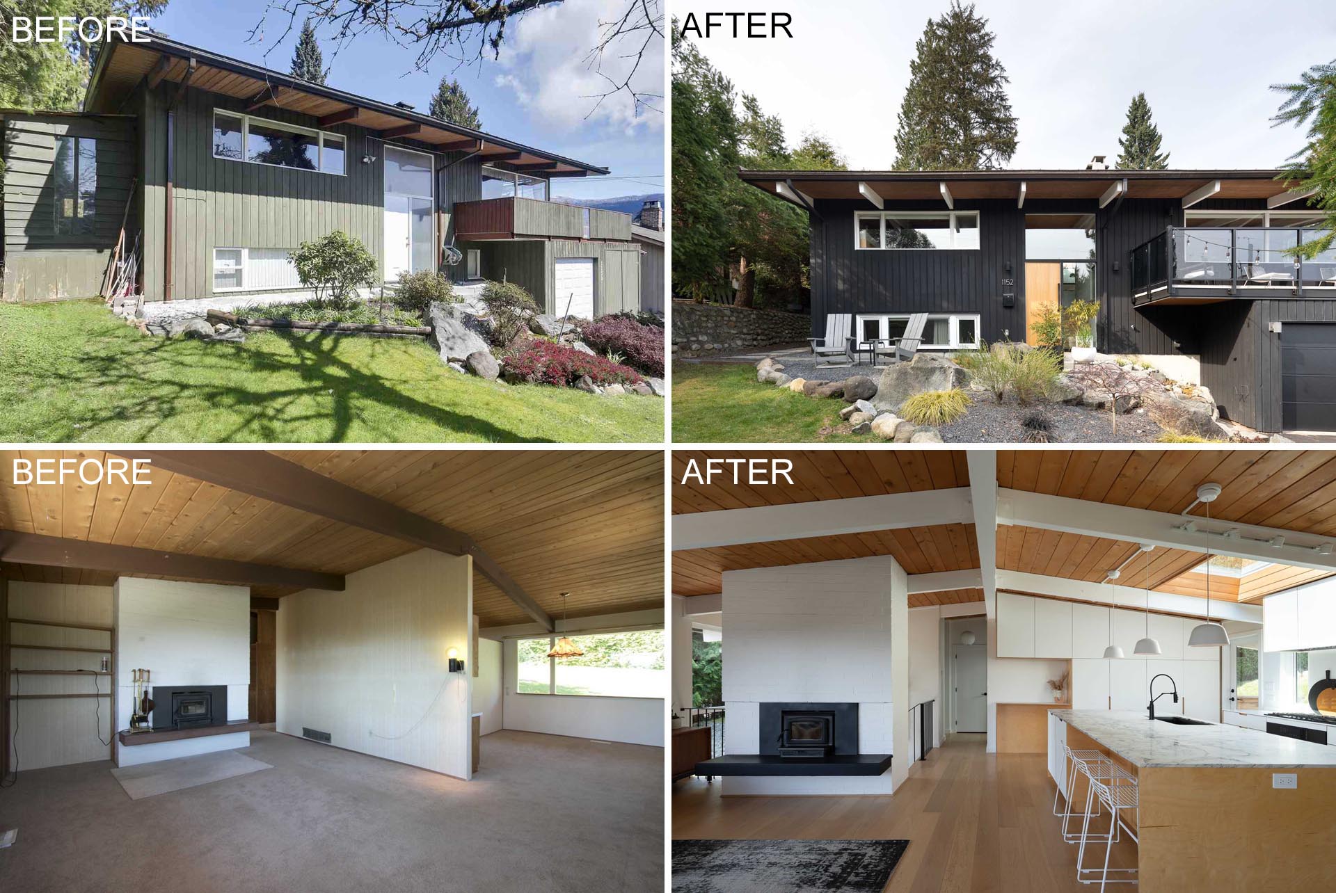
Real estate agents West Coast Modern, has sent us photos of their latest listing, a remodeled 1968 mid-century modern home in Vancouver, Canada.
Let’s take a look at the ‘before’ and ‘after’ photos of the home…
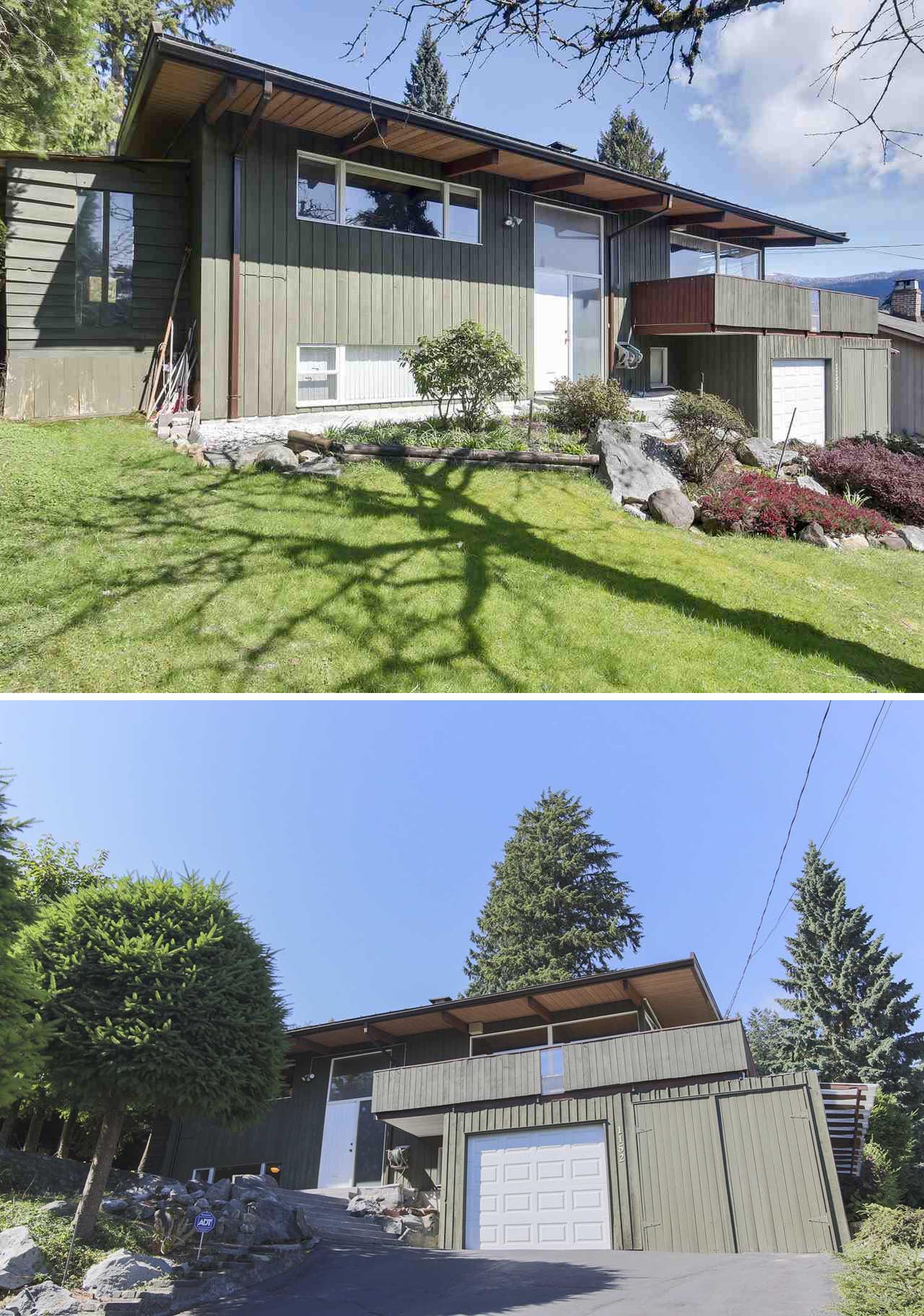
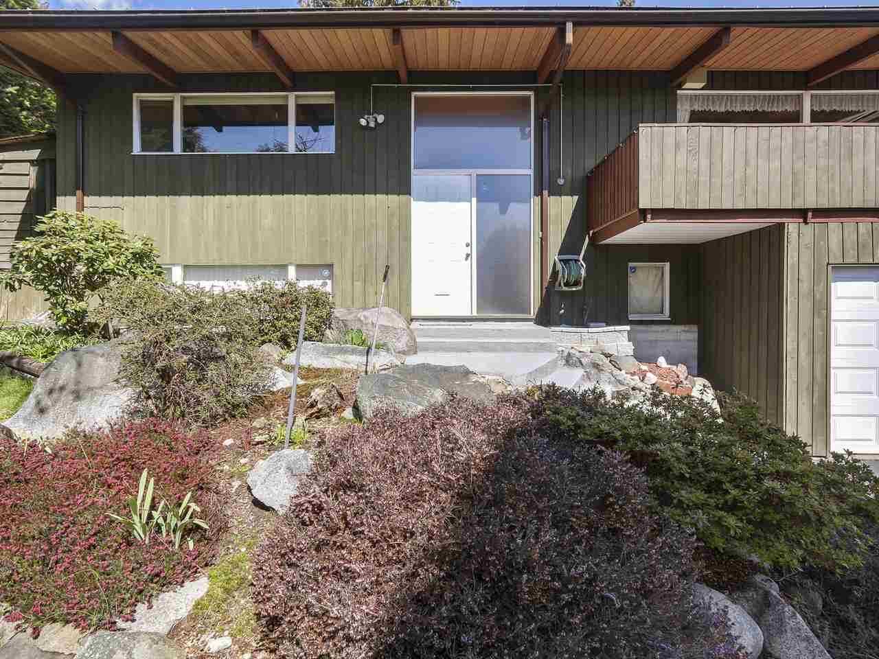
Before – The Exterior
The original home had faded green paint and white framed windows that matched the garage door. Above the garage, the deck had a railing that matched the vertical wood exterior of the home.
After – The Facade
The remodeled facade included a fresh coat of black paint, glass railings on the deck, a new wood front door, white accents, and a Granite rock garden with a seating area.
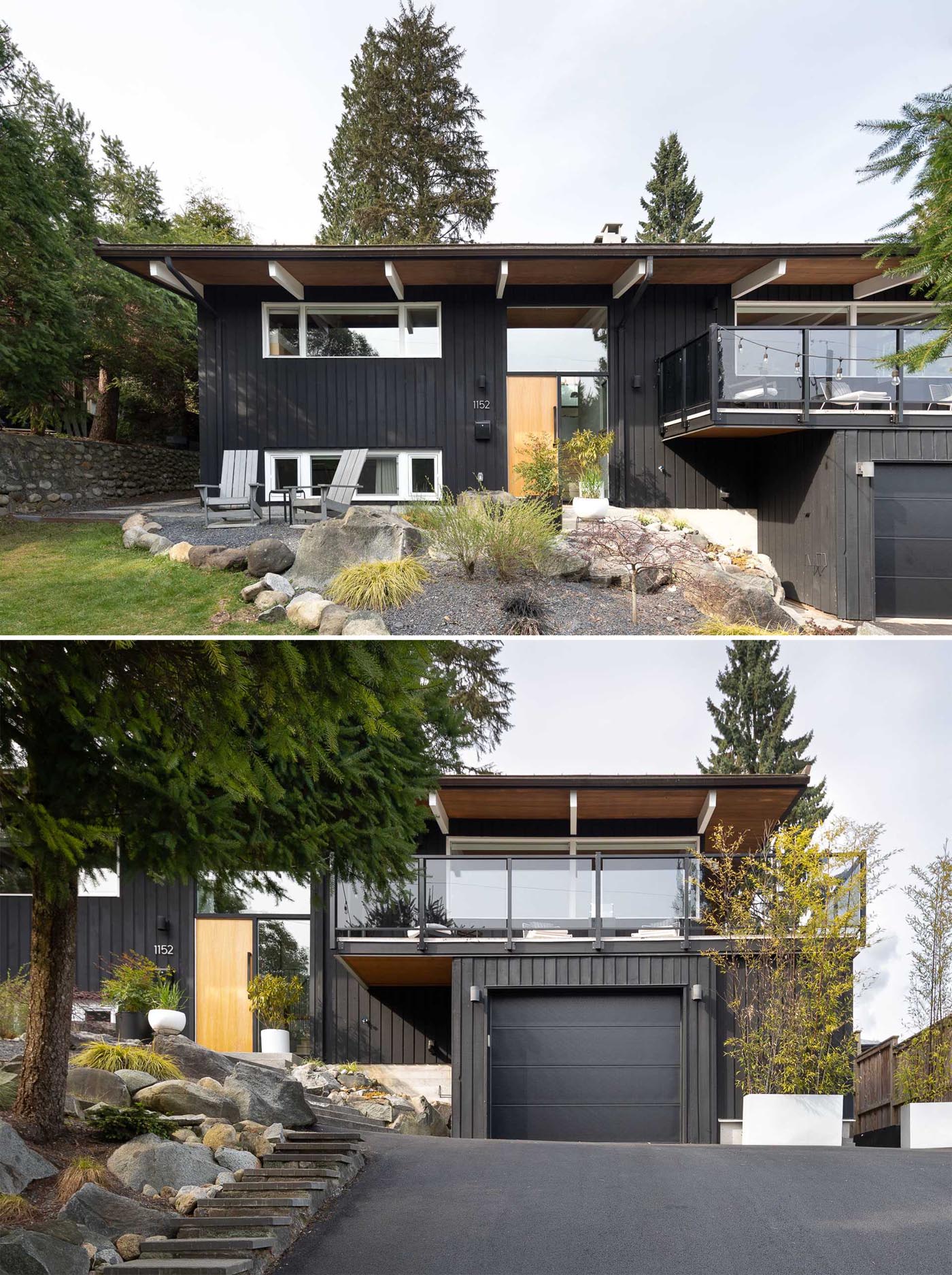
Photography by Dan Kirchner
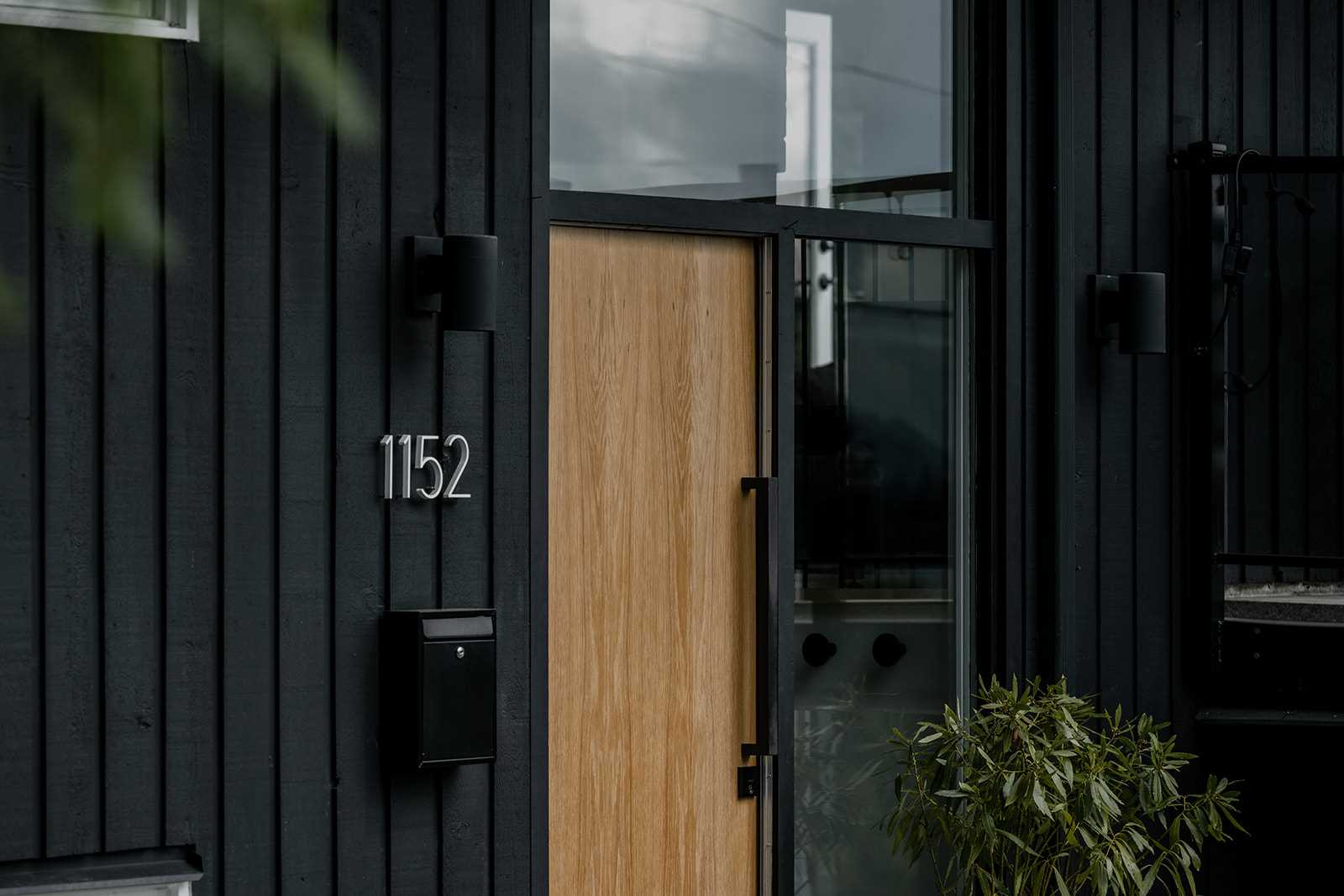
Photography by Yan Timo
Before – The Rear Of The Home
The rear of the home had a dated deck with mismatched colors, that connected the house with the elevated backyard.
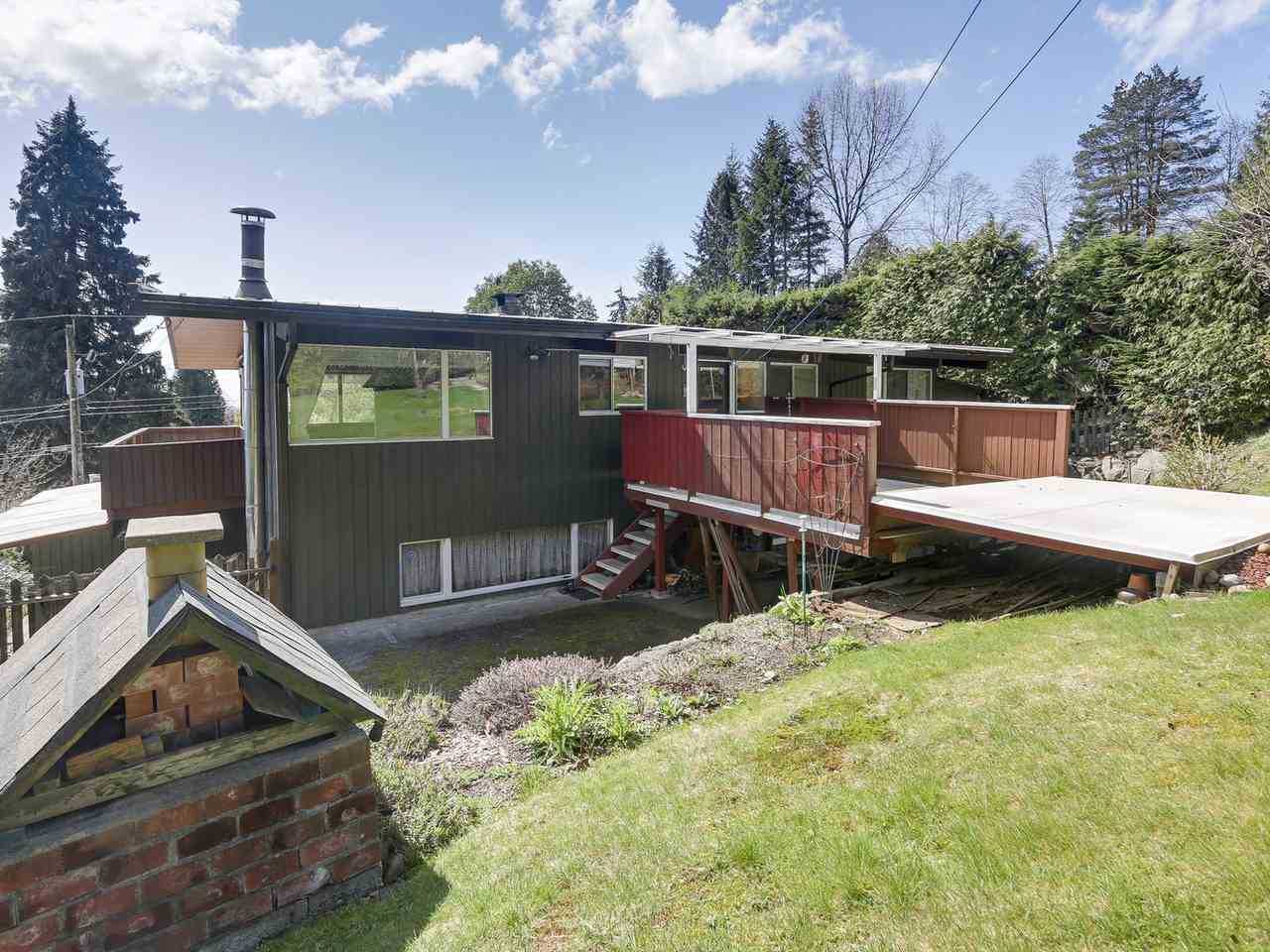
After – The Rear Of The Home
The new deck, which is made from Cedar, allows the kitchen to lead directly to the outdoor patio area, which has been furnished with a dining area. The private backyard is now surrounded by 15-foot mature hedges, while a new metal roof was also added to the home.
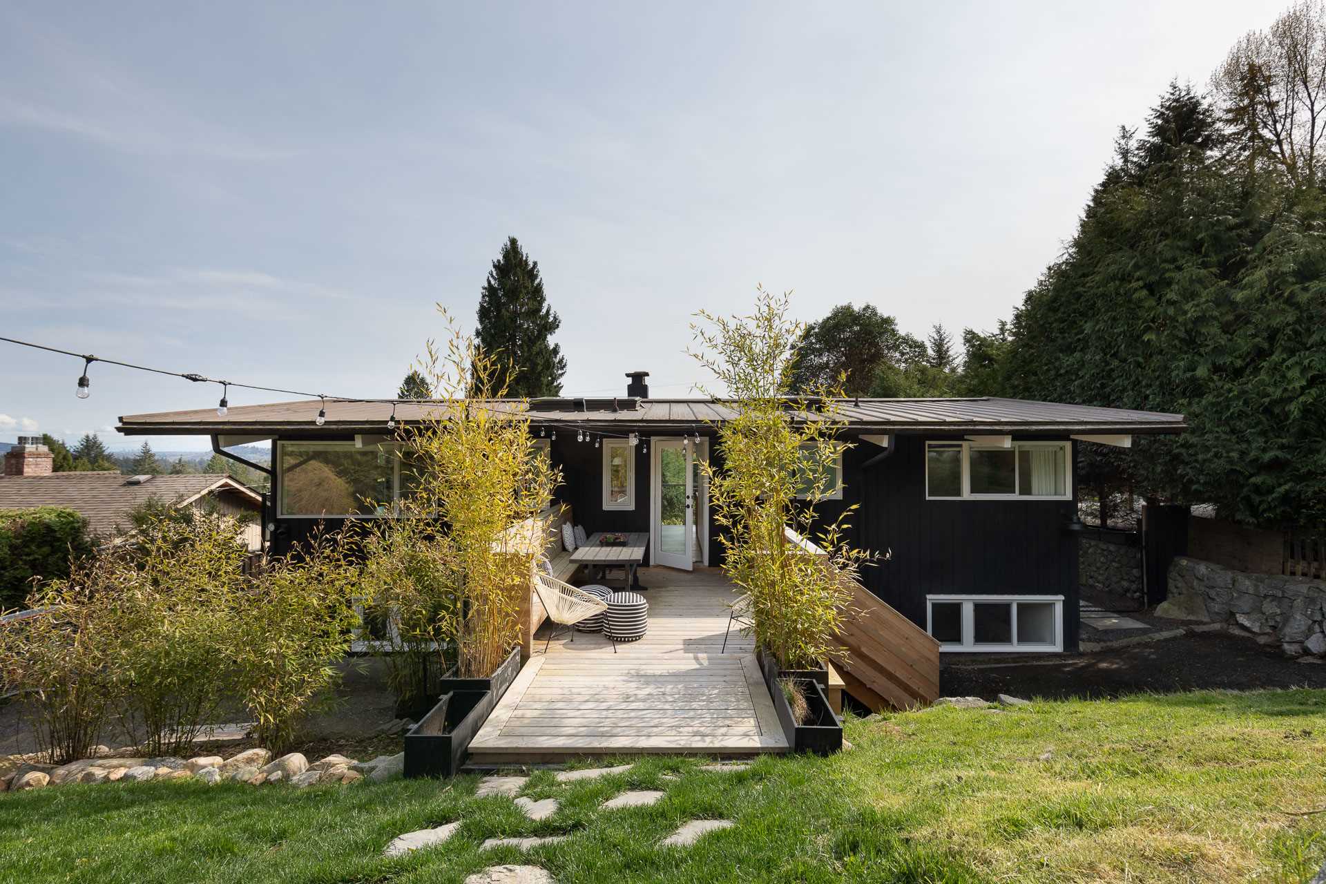
Photography by Dan Kirchner
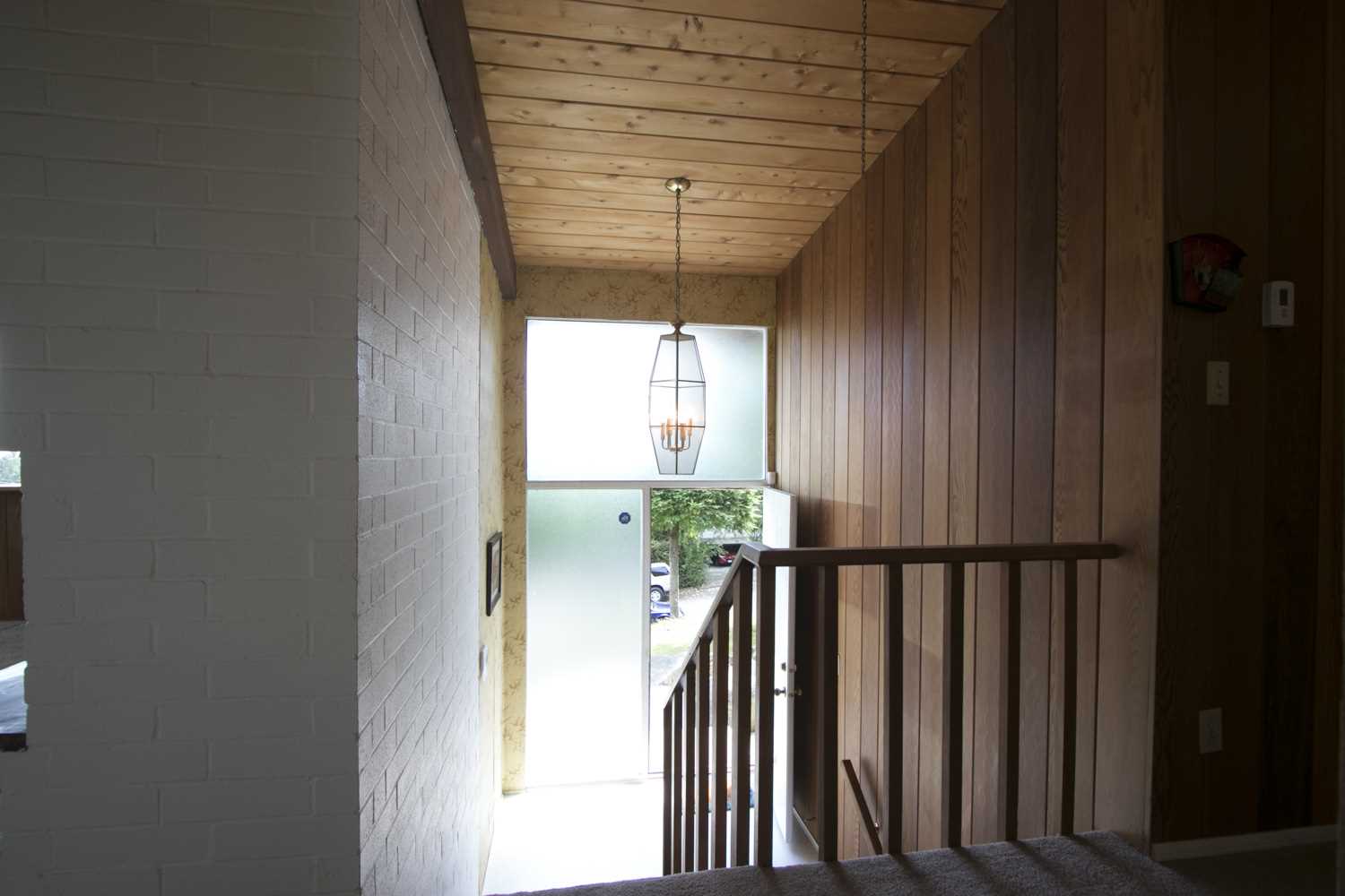
Before – The Entryway
The original entryway of the home had dark wood paneling on the wall and lighter wood on the ceiling. Patterned wallpaper on the wall also surrounds the front door and frosted windows.
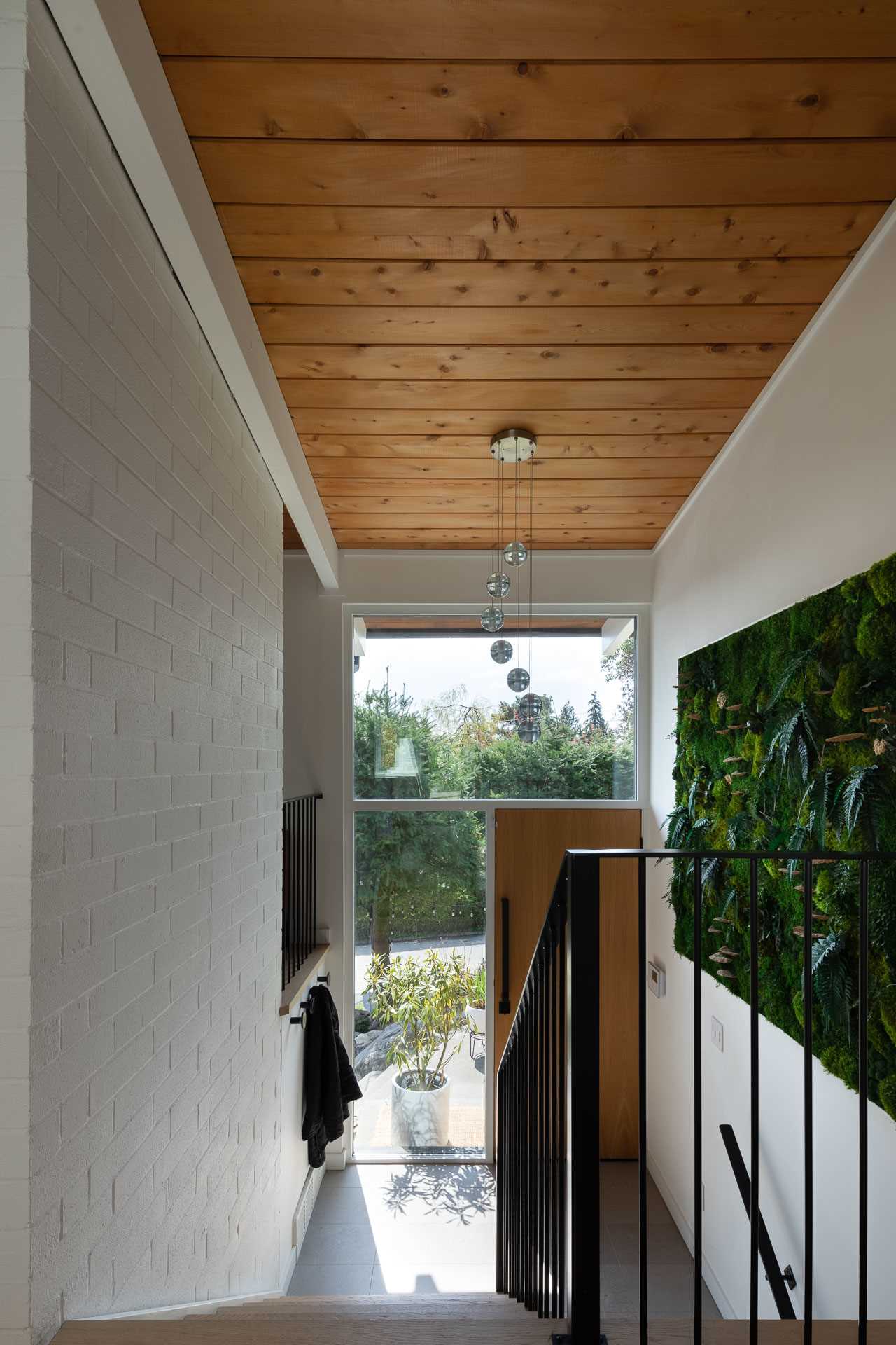
After – The Entryway
The updated entryway retained the wood on the ceiling, however, the wood on the wall was removed and replaced with a white wall and accent green wall, brightening up the space. On the opposite wall, a section of the wall was removed, and the frosted windows were replaced.
Photography by Dan Kirchner
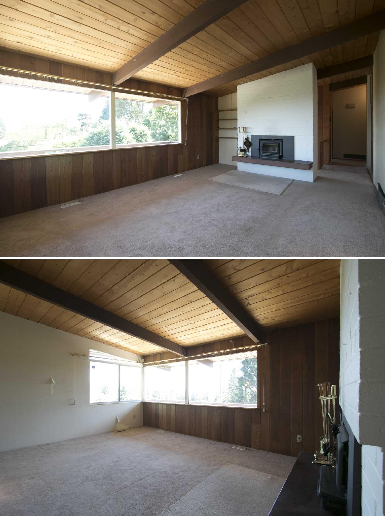
Before – The Living Room
The original wood paneled walls continued through the living room, making the space appear dark, while carpet covered the floor.
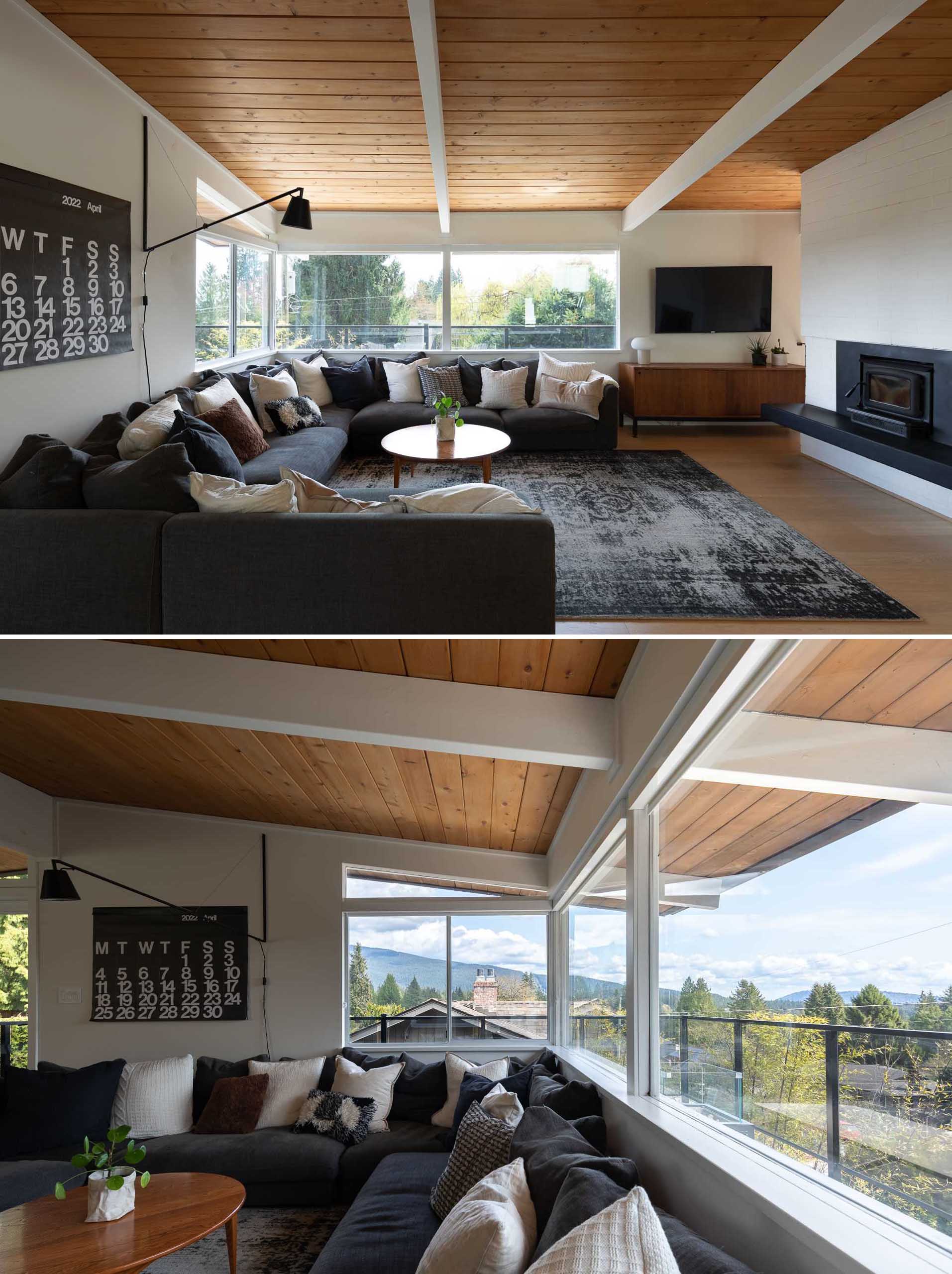
After – The Living Room
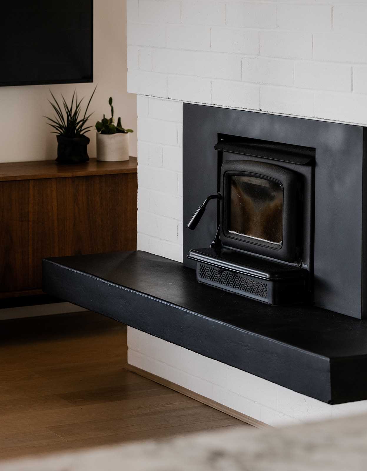
The updated living room had the wood paneling on the wall removed, and replaced with bright white paint. The cedar ceiling complements the new White Oak engineered wood floors.
Photography by Dan Kirchner
Photography by Yan Timo
Before – The Dining Room
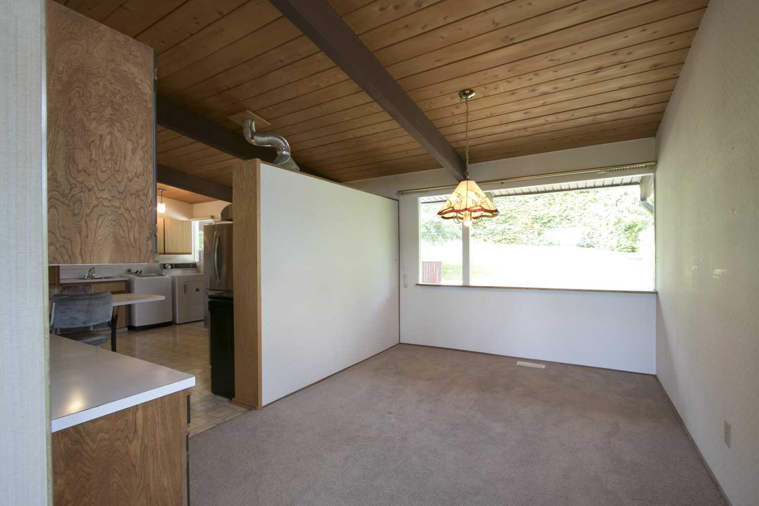
The original dining room was located adjacent to the living room and partitioned off from the kitchen.
After – The Dining Room
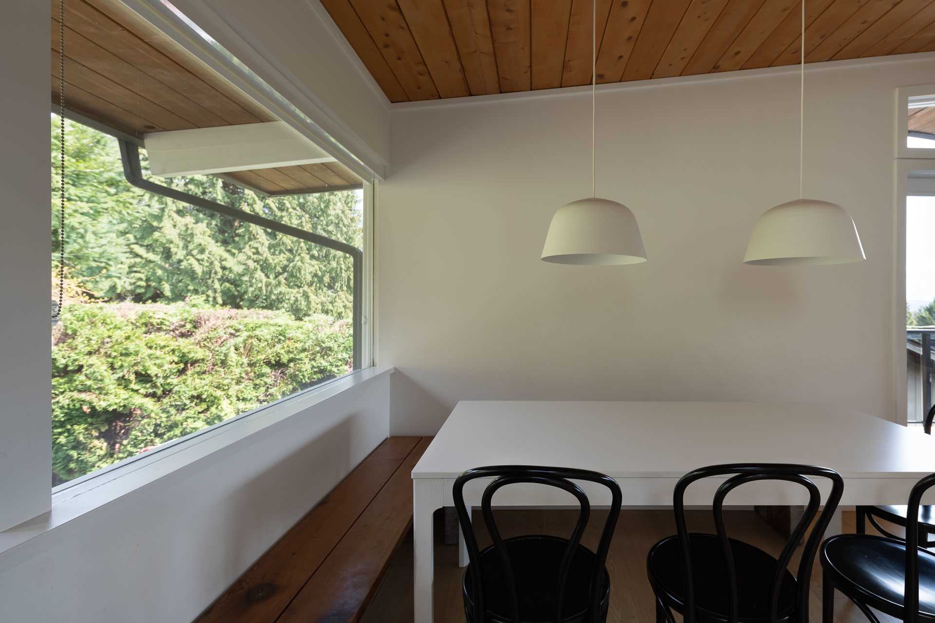
The new dining room is open to the living room and kitchen, and now includes two minimalist white pendant lights hanging above a simple white table.
Photography by Dan Kirchner
Before – The Kitchen
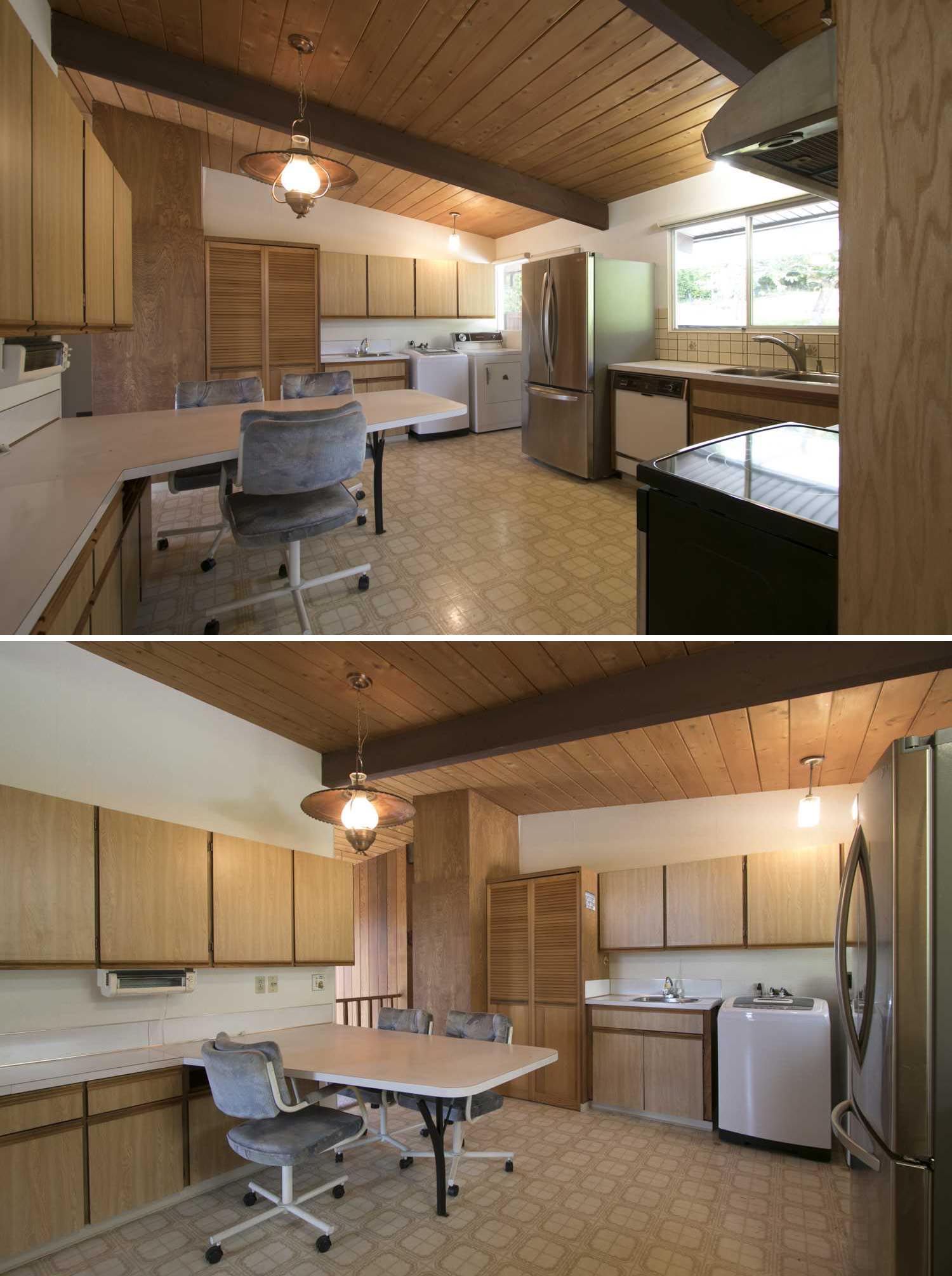
The dated ’60s kitchen included wood front cabinets, patterned linoleum flooring, and a peninsula countertop that acted as a casual dining area. There are also mismatched appliances.
After – The Kitchen
The new kitchen had some dramatic changes. Walls were removed to open it up completely to the living room and dining room. The wood cabinets were replaced with minimalist white cabinetry, and an oversized 10-foot by 5-foot marble topped kitchen island was added.
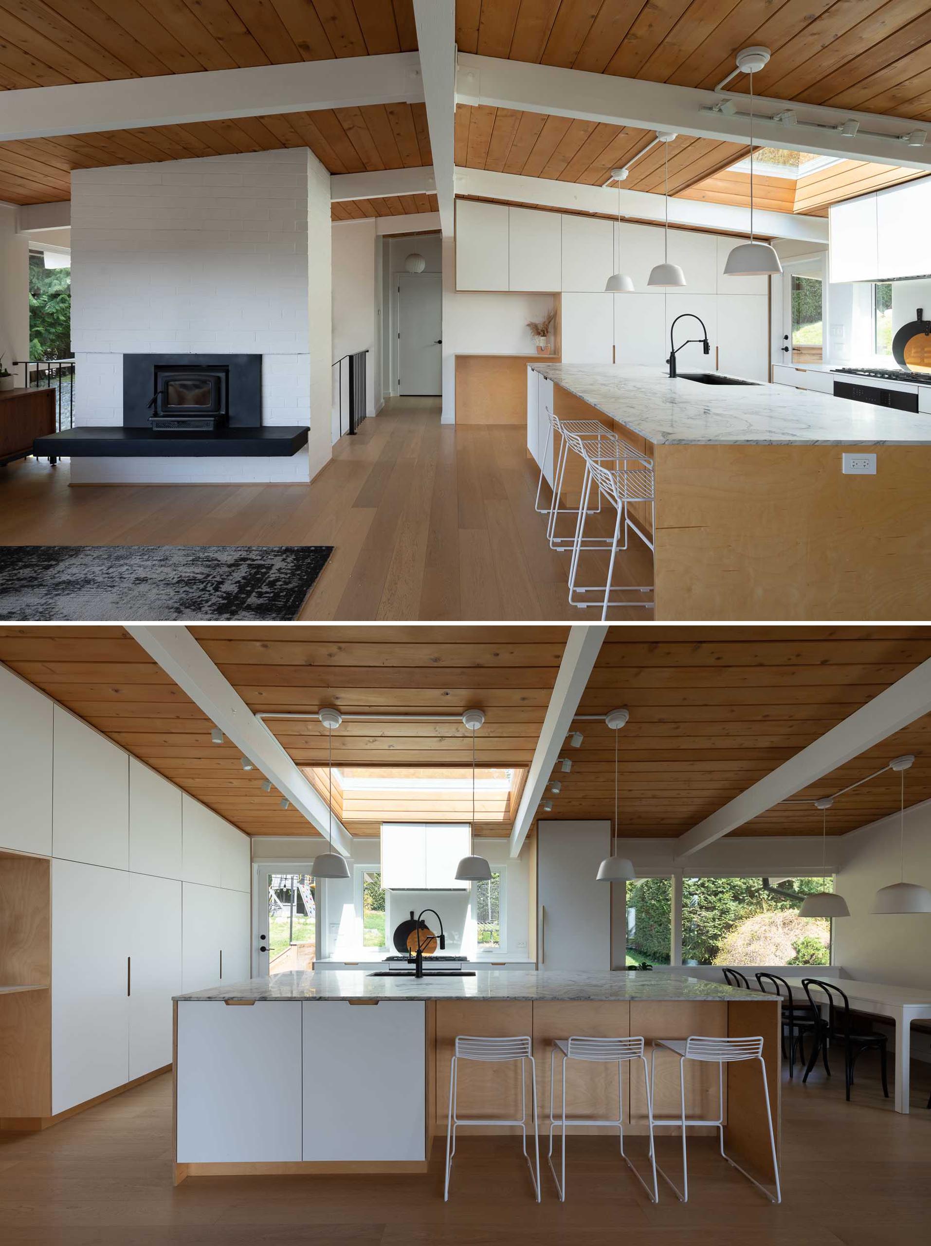
Photography by Dan Kirchner
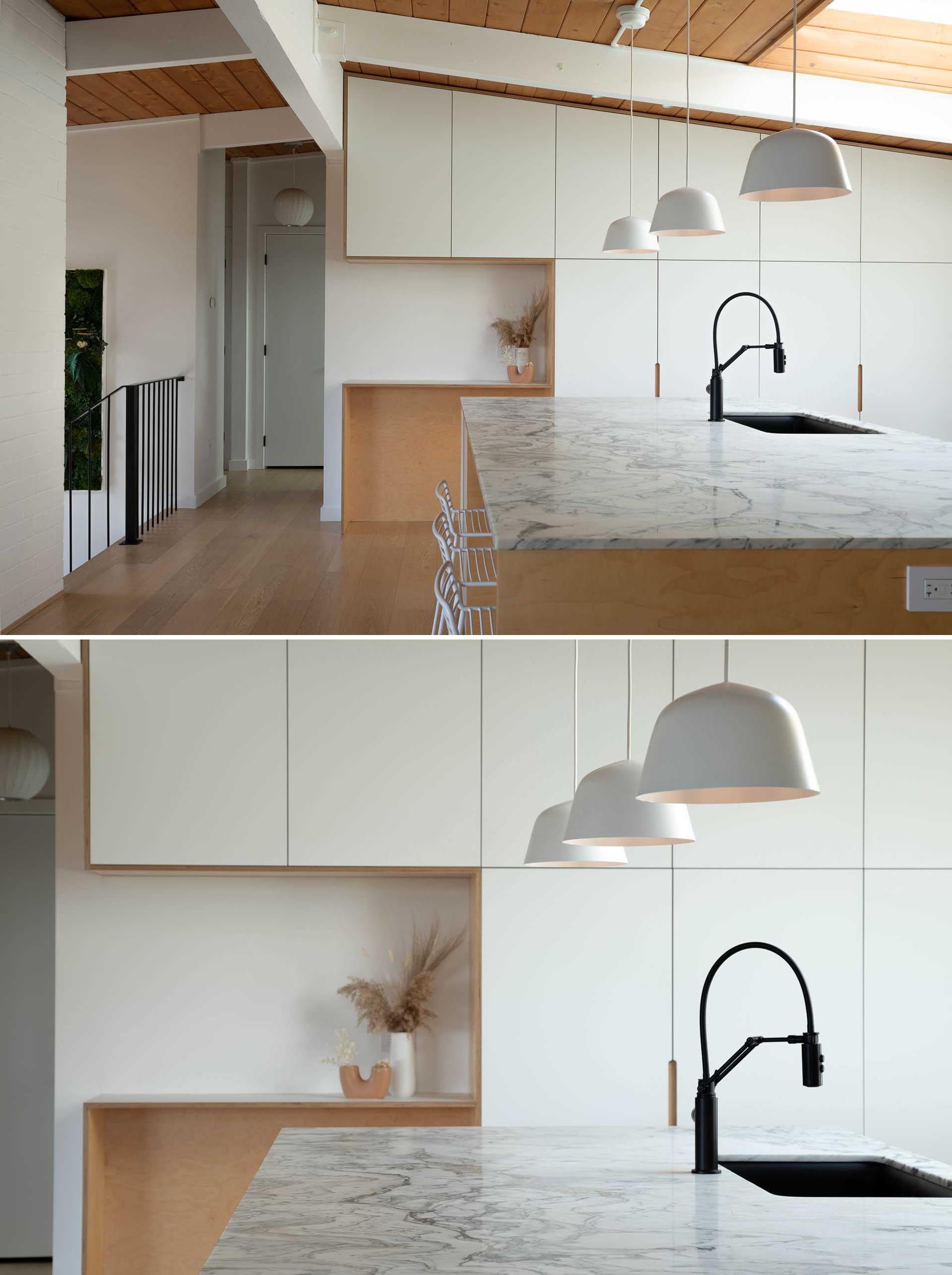
Photography by Dan Kirchner
Before & After – The Primary Bedroom
The original bedroom includes a full-wall mural with trees, while the carpeted flooring and wallpaper make the room appear dated. The remodeled bedroom includes fresh paint and mid-century furnishings. The short curtains on the window were replaced with long curtains, and the black curtain rail adds a contrasting element to the room.
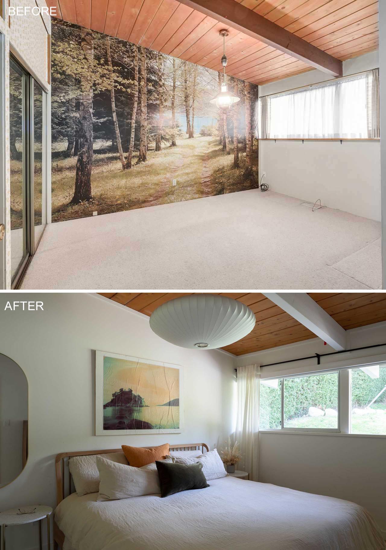
After photo by Dan Kirchner
Before – The Children’s Bedroom
The wood paneled walls are also found in this bedroom, making the room feel much smaller than it is. On the opposite wall, there’s a pair of dated scones.
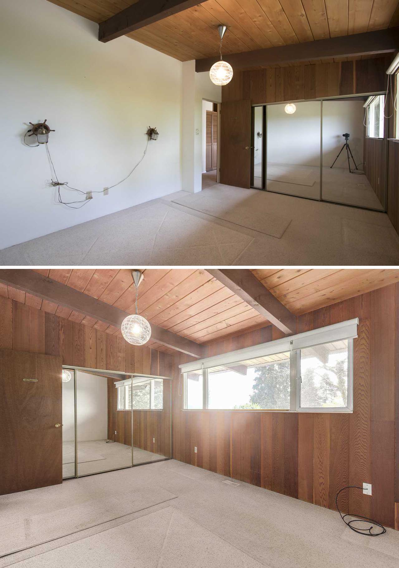
After – The Children’s Bedroom
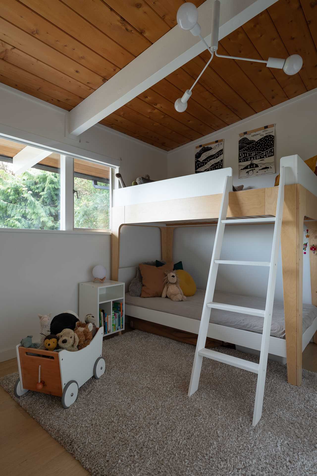
The new bedroom has white walls, matching the white painted beams and ceiling light, while a bunk bed makes the most of the space.
Photography by Dan Kirchner
Before – The Bathrooms
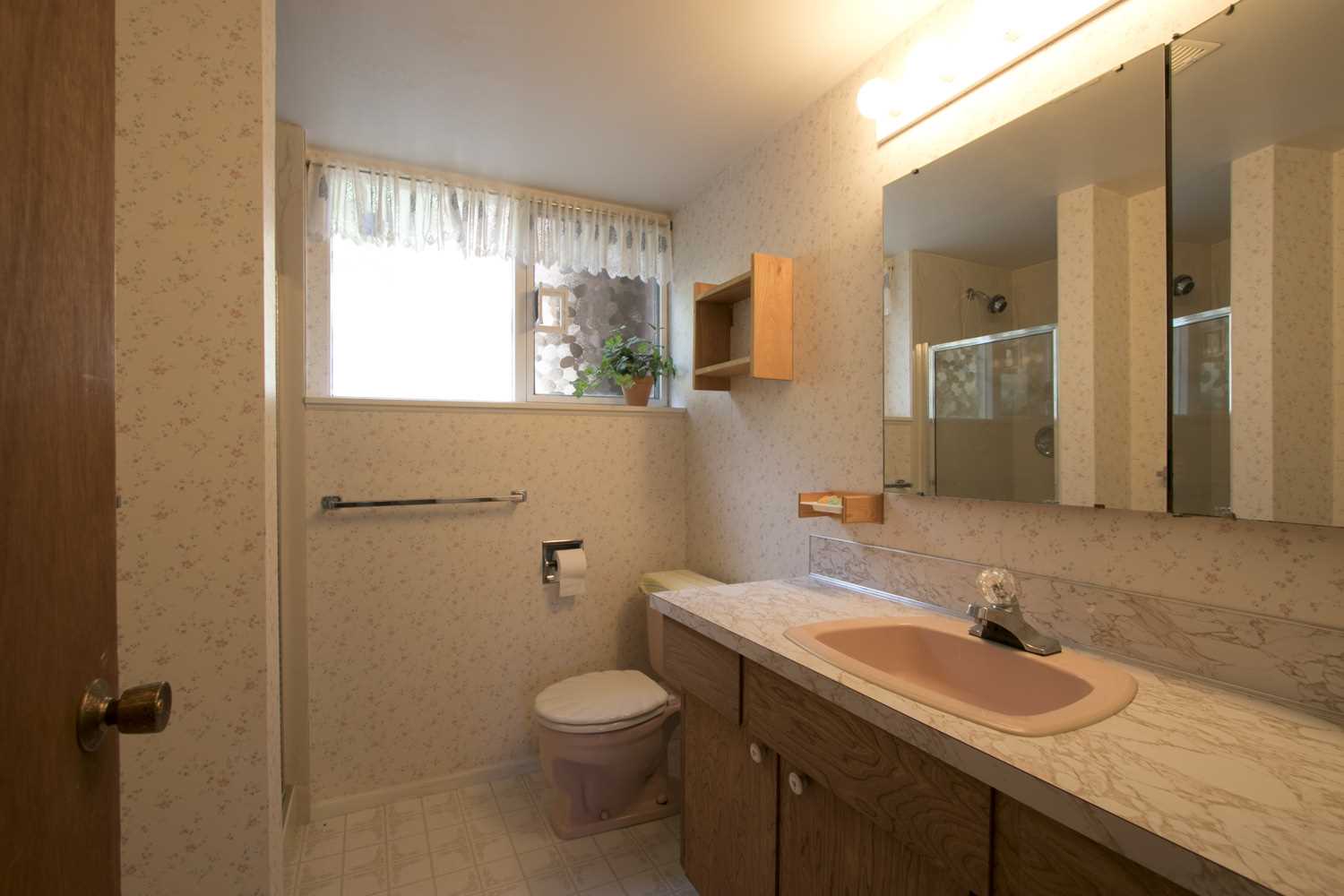
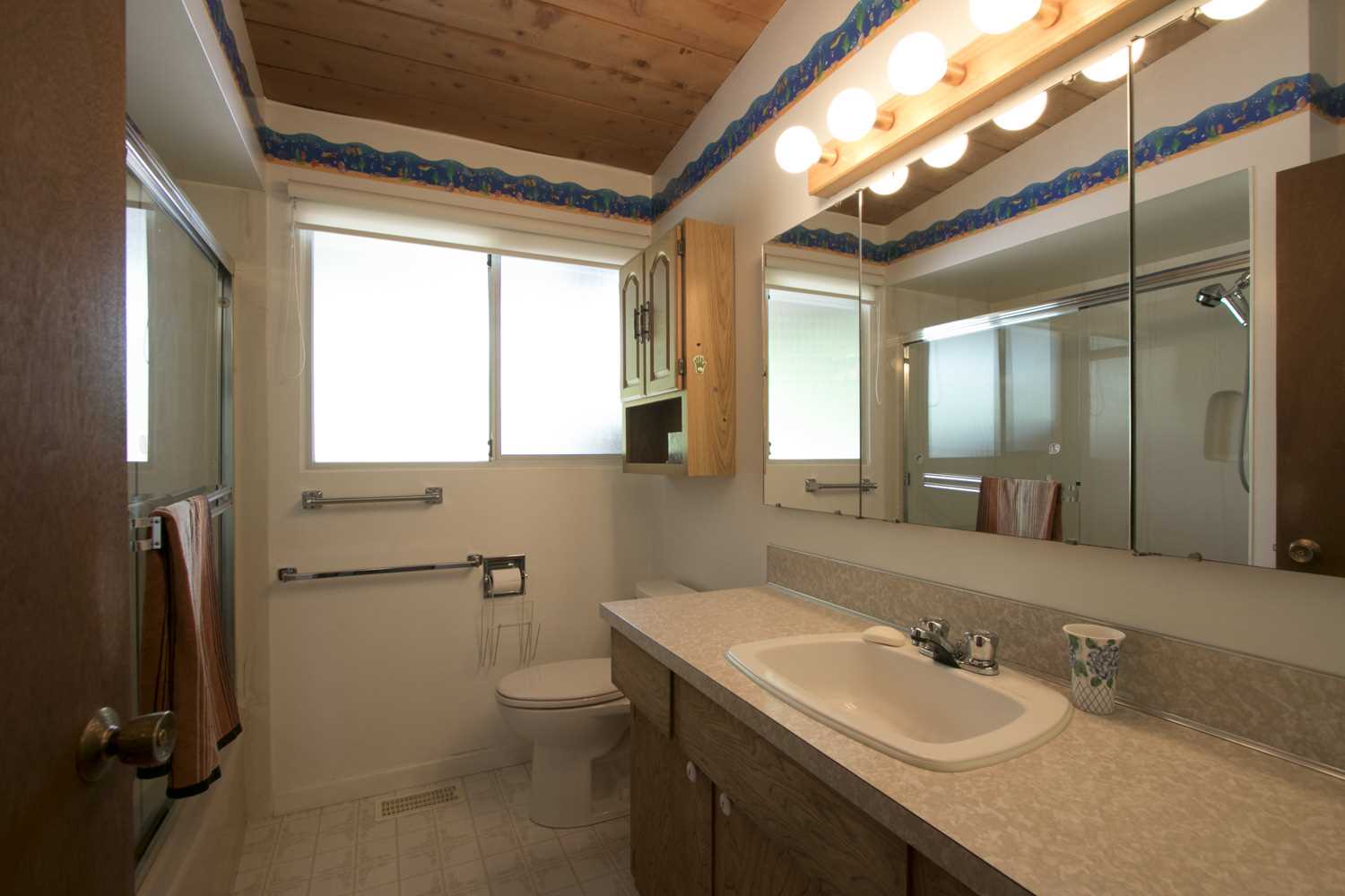
The original bathrooms were dated, with wallpaper making another appearance.
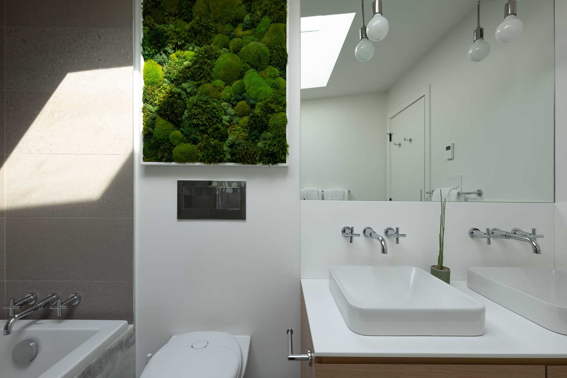
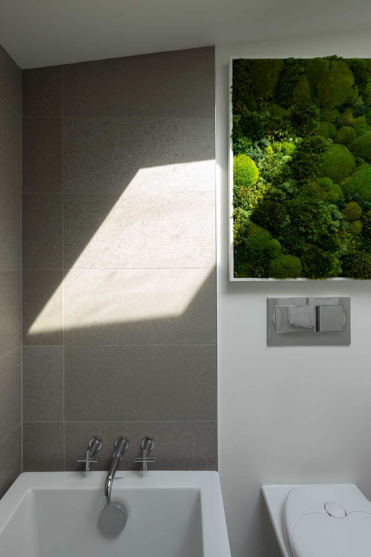
After – The Bathrooms
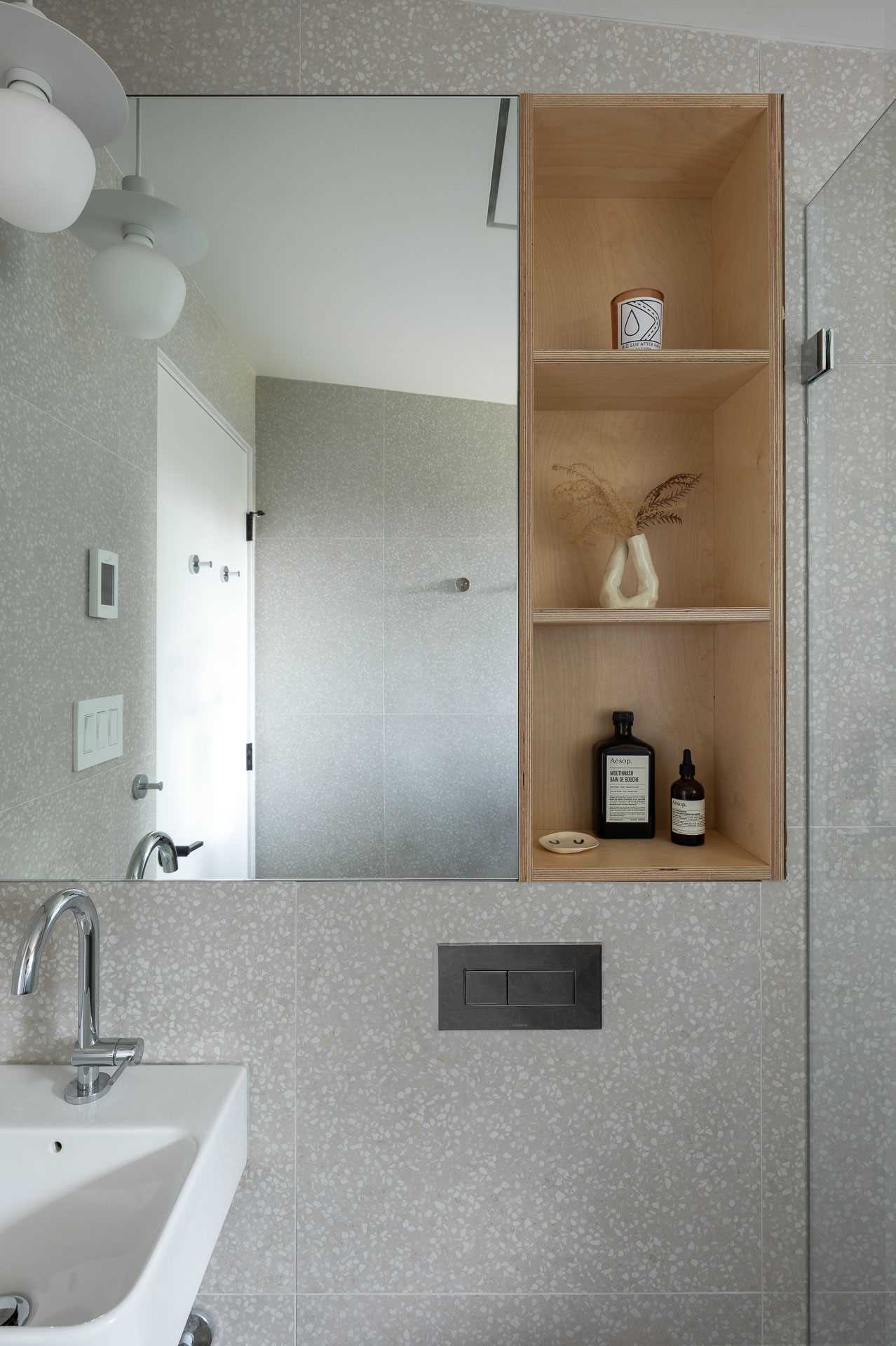
The updated bathrooms are much more contemporary, with frameless shower screens, terrazzo and large format tiles, and wall-mounted toilets.
Photography by Dan Kirchner
Photography by Dan Kirchner
Photography by Dan Kirchner
Watch the video below to see an interview with the owners who completed the remodel.
Source: Contemporist


