UP! BERLIN


Architect / Designer:
Studio:
Country:
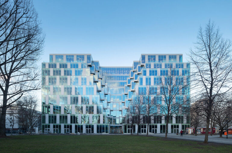
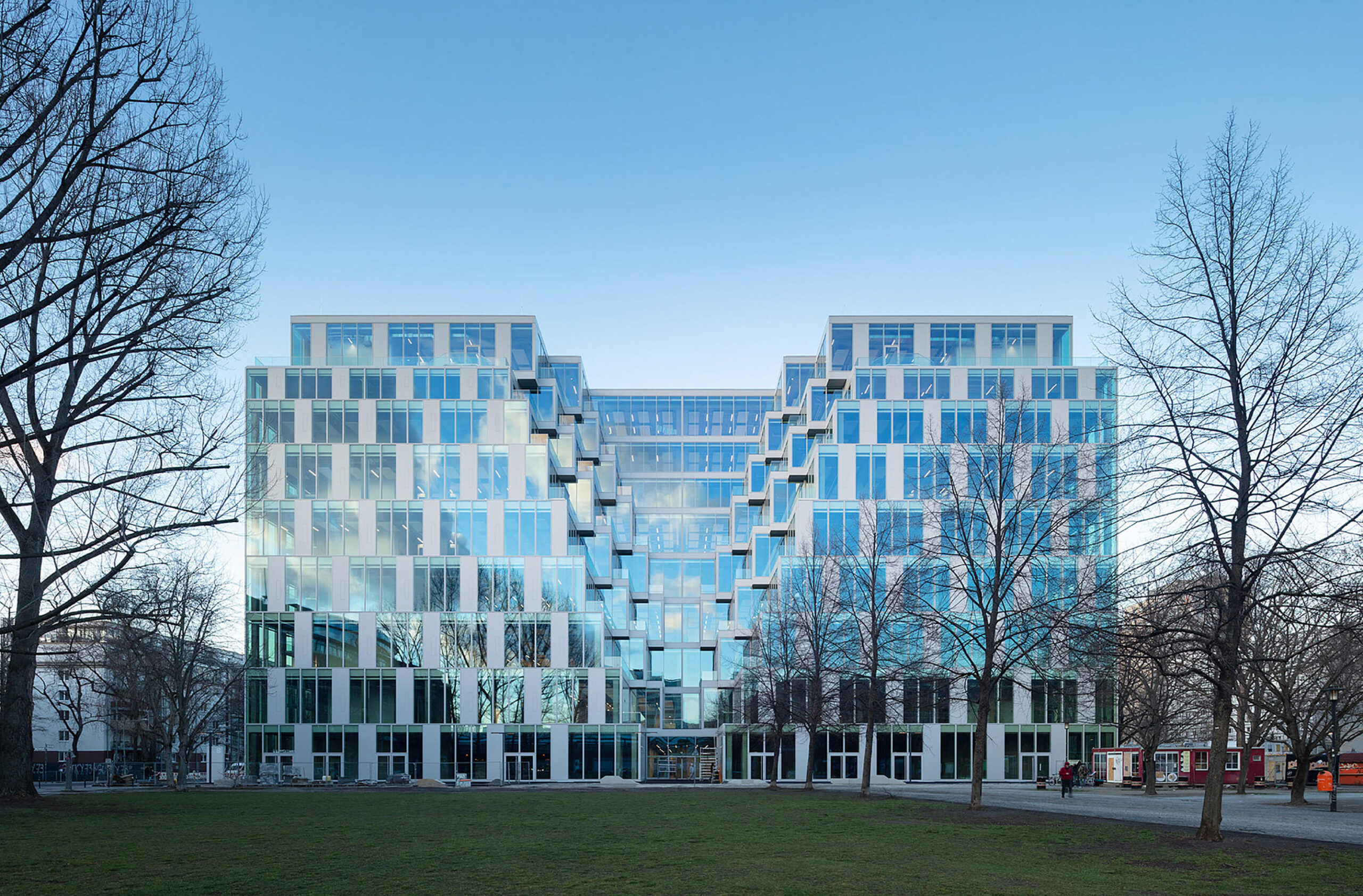
The old department store was originally conceived as an introverted building without openings to the outside. That principle had to be reversed: the interior daylight situation was a major challenge. The idea presented in the competition by JASPER ARCHITECTS was to cut triangular-shaped prisms on each side of the squared building to flood the interior with natural light and by this, loosen up the massive monolithic geometry. These “voids” redefine the building’s urban presence entirely, opening up the volume on all four sides.
“The dimensions of the UP! were all too familiar for us: the existing building looked like a monolithic extrusion of a typical city block of Buenos Aires. Those keep confronting the architects with one main challenge: How is the provision of natural lighting dealt with? Cuts of all sizes and forms are made into the urban mass and urban planning regulations of different times overlap – those create complex urban geometries that always arise from the same squared base of the city block. For us, this was an inspiration for our proposal for the UP!” (Martin Jasper)
The floor space that had been cut out was regained by two added floors on the top of the existing structure, plus a roof pavilion and extensive rooftop terrace. The entire existing facade was removed and the building block was reduced to its concrete skeleton. With huge circular saws, the voids were cut out of the old structure.
What remained, was a regular grid of concrete columns subdividing the floors every twelve meters and four cores. Parts of the history of the building were uncovered, decades of history left their patina on the bare concrete; old technical infrastructure and rusty traces became visible and were kept in place. The rough, industrial charm became a canvas for the new era.
The facade is composed of two types of modules: a fully glazed and an opaque module with integrated casements. They cover the entire facade in a ratio of three to one, providing the necessary amount of shade for sunlight regulation. In the voids, glass doors are integrated to give access to the terraces. The old skeleton is revealed to passers-by behind the new glazed envelope, and the urban environment can be experienced as a full panorama view from all levels.
To organize the vast floor areas into different zones, meeting room boxes and translucent cast-glass walls are distributed strategically along with the floors. The flooring color concept adds another layer to the zoning, defining functional areas without physical boundaries. What was once an interior-focused shopping center has been reimagined as an outwardly focused center for productivity, creativity, and community.


